How would you summarize the Portfolio Review, in regard to your experience?
- A rare glimpse into an honest window
- Open dialogue with famously shrewd creative directors
- Closely-guarded tips to crack into a monolithic ivory tower
It takes guts, strong will, and dazzling talent to be invited to a Student Portfolio review. I have seen a dizzying array of work. The work is directly related to the education and tools each student has been taught. Some design schools are known for recruiting strong talent: so strong that when you see that school’s name on the card, you know you don’t have to worry about that student’s future. But I have been blown away and barely moved. The students that have the brightest futures can be identified right away.

Closely-guarded tips to crack into a monolithic ivory tower
As a volunteer reviewer, what aspect of the Review do you enjoy most?
It is a true treat for accomplished designers to be ten years into their careers, and be given the opportunity to see the trends being taught at the best art schools.
How would you encourage other design professionals to volunteer for the Review?
I learned about several free and powerful tools that have helped me in my own workflow just by being a volunteer at Student Portfolio. A student told me about GraphicBurger.com, and I now use it constantly for client mockups. I am refreshed about what I do for a career when I leave the Reviews, and I could emphatically portray that feeling to a disillusioned colleague in the field. It is so easy to feel dated and obsolete. These Reviews remind me to try new things. I particularly enjoy sharing “secrets” we’ve all learned in our jobs, and watching the budding creatives feverishly scribble into their Moleskins things I said as if I just gave them an answer they have searched for a long time.

I particularly enjoy sharing “secrets” we’ve all learned in our jobs, and watching the budding creatives feverishly scribble into their Moleskins things I said as if I just gave them an answer they have searched for a long time.
What piece of advice or tips would you share with future student attendees?
You are going to feel like you have made a huge mistake when you get out there and start interviewing. Job interviews are designed to test your aptitude at knowing your stuff well, knowing that company or organization well, as well as selling yourself. You are the product, and your portfolio will be unrecognizable in two to five years. Do not take the job rejections personally, but realize that even though you have an amazing portfolio, it might be that your personality was not the fit. Artists are sensitive. I get that. But you have to fit into an already prescribed mold at most jobs, and if you do not match you will either feel resentful in six months, or the interviewer can sniff out the wrongness right away. Unless you start your own company, and if that is you, then congratulations! But then you have to worry about hiring good employees that fit your mold. My point is, work on your people skills. Get out from behind the Mac, and look people twenty years older than you in the eye, and do not assert you know everything because you were the best designer at your high school. Be humble, but show your talent.

Open dialogue with famously shrewd creative directors
What piece of advice or tips would you share with future reviewers?
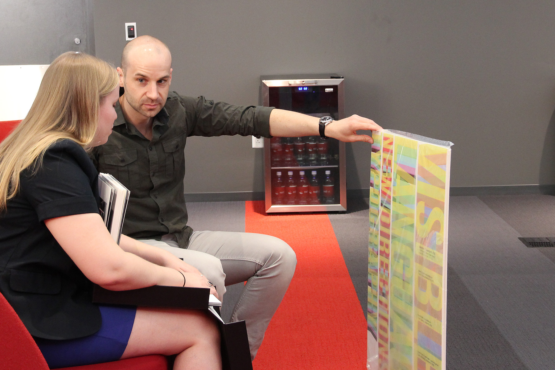
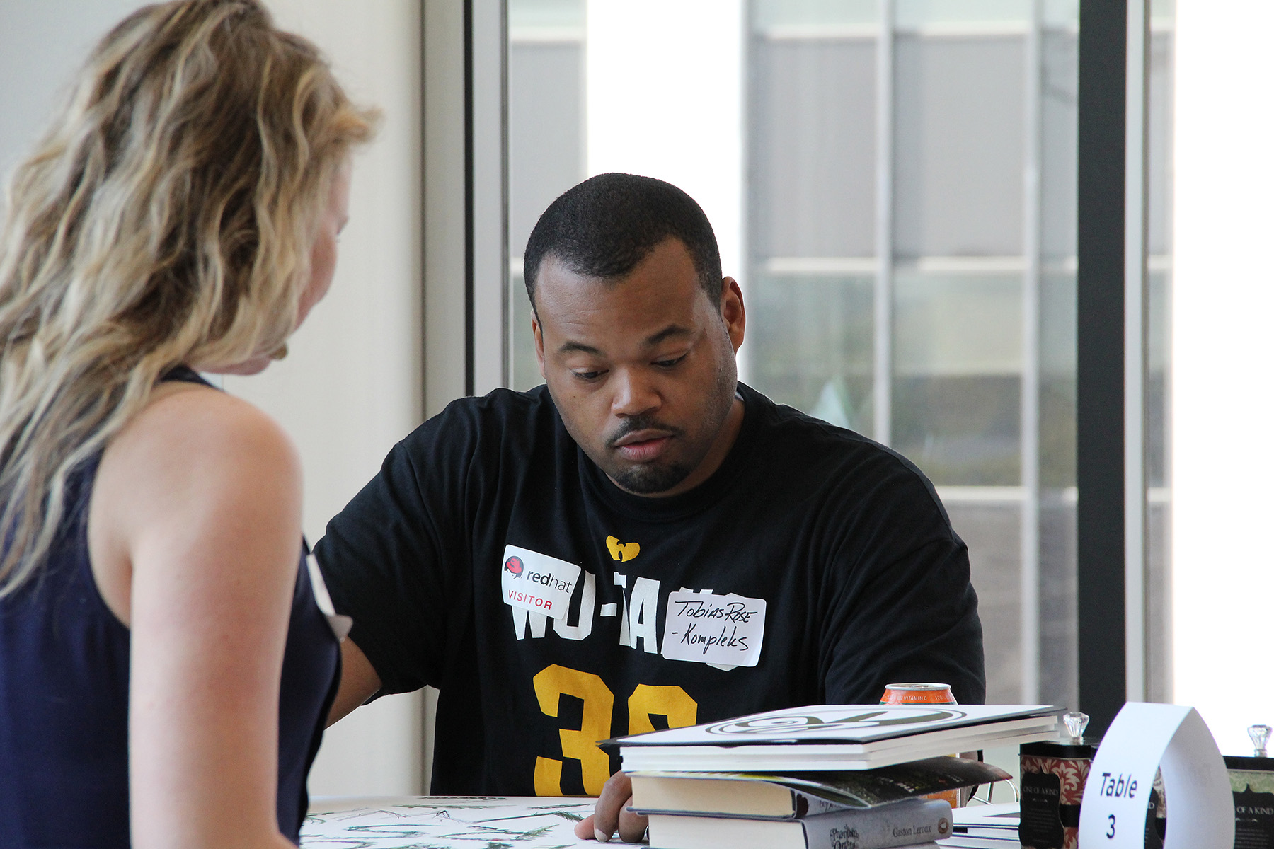
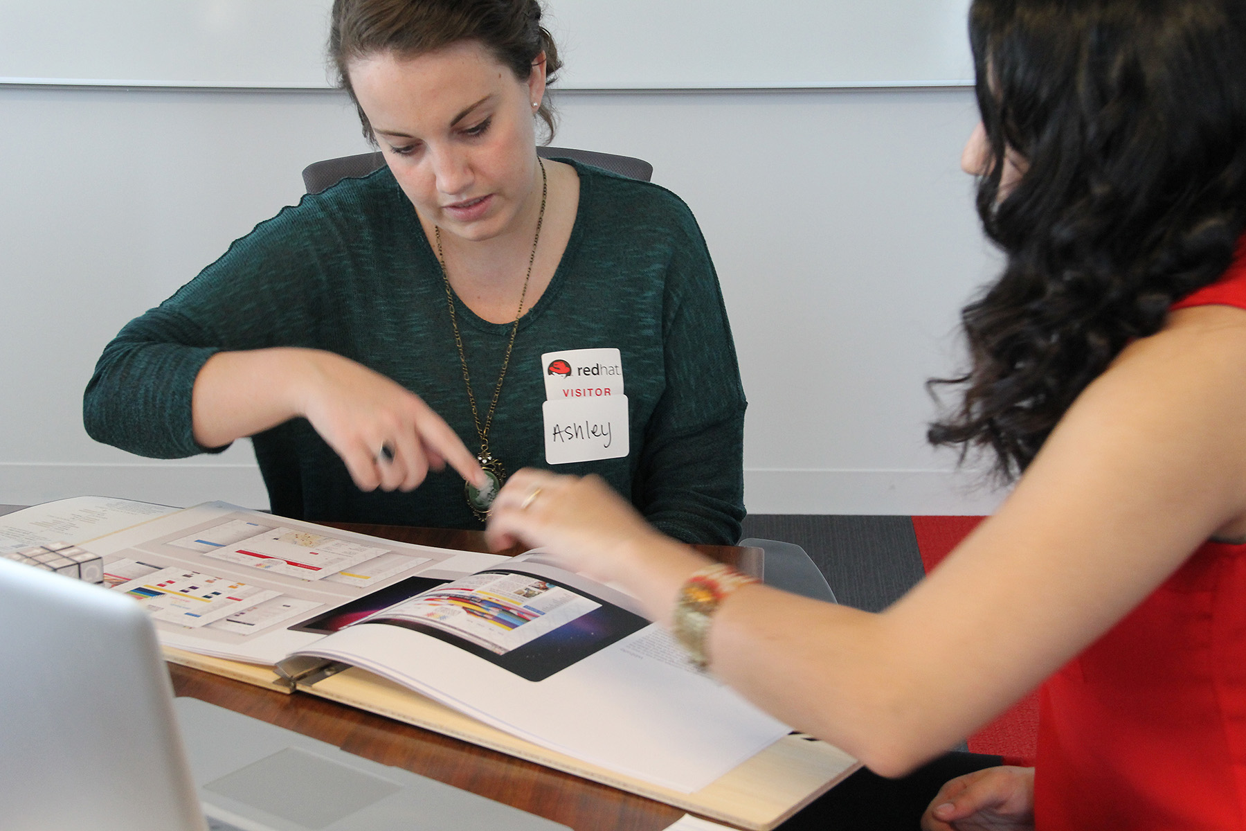
Be patient. These are people that are usually quite sensitive, so be sensitive about that. Some are kids, and are used to being told they are the best illustrator in their town. But they might not be the best you’ve ever seen. Just don’t make them feel small. Then there are others that are doing complete job changes and are in a big life change: new kids, new husband, new city. Do not assume they should have been in graphic design school right out of high school. Do not assume they do not have natural talent. And do not assume they don’t already assume you think they might have a tough competition against other portfolios. They usually work full time and have other obligations besides drawing pictures. Some have more time on their hands and their portfolios show that. But be sure to look between the lines, and look for honest hard work, not just page filler. Let them talk, but also ask good questions. Some students will try to talk over you or give excuses for a poor quality image or incomplete page. Be firm, pretend you are truly offering them a job at Pixar designing Toy Story 4. Show mercy but give credit where credit is due. Also allow yourself to be surprised by the variety of portfolio styles that exist out there. Some kids will spend an exorbitant amount of money on the presentation books with custom die cuts, but have little substance on the inside. Some bring the standard big black zipper cases, and some have no book at all but a box of 3D packaging they built. Each one is special, beautiful and unique in their own way. So give them an opportunity to show their stuff and toot their own horn!
Author of this post:
Niki DeGroot
 Design is my original passion: I was always doodling, drawing, and creating as a kid, which brought me to North Carolina’s Appalachian State University for graphic arts.
Each Christmas I would receive sketchbooks, General’s Pencils, paints, and erasers. I used these tools to document my observations and imagination. I trained my eyes to see and astutely inquire as an artist. The challenge I soon discovered was getting befuddled minds to interpret my scrawling. Today, I still get creative tools for Christmas, but now in the form of Adobe software or books on digital design. I have cultivated a deep understanding of form, rooted in design and layout. I am now a seasoned pro who can navigate the delicate balance between getting the message out effectively, and keeping the pure artistry of the content intact.
My passion is developing new, powerful and engaging creative solutions that can turn a head, and win an award.
Website: designbydegroot.com
Email: info@designbydegroot.com
Linkedin: linkedin.com/in/nikidegroot
Photographer of this post:
Basia Coulter
 Formerly a researcher in neuroscience, I gradually transitioned into design for web and mobile. Having discovered a professional niche as a UX/UI designer at NC State University, I continue to find fulfillment in visual design and photography. A Durham resident, I am inspired by the creative communities in the Triangle area and feel privileged to have opportunities to contribute to the rich culture of our region as a community member at AIGA Raleigh and a co-leader at Girl Develop It RDU.
Website: basiacoulterdesign.com
Email: basia.coulter@raleigh.aiga.org
Twitter: @BasiaCoulter
LinkedIn: in/basiacoulter
Sign up today to be a volunteer or a reviewer for the 2015 AIGA Raleigh Student Portfolio Review which will be held on March 28, 2015 at Red Hat in downtown Raleigh.
If you have questions about the Student Portfolio Review, please visit AIGA Raleigh Student Portfolio Review or feel free to contact one of the following: Director of Design Ability, Kristin Fowler, or the Co-Directors for Student Programming, Sophia Hitchcock and Jacqueline McAdams.