To celebrate AIGA’s Centennial, AIGA Raleigh invited designers to create posters inspired by events that took place in the Triangle region over the past ten decades. Participating designers were asked to select a decade of interest and to submit work focused on an event occurring in that decade and designed in a style representative of the decade they chose.
I was excited to participate in this poster exhibition. I’ve been long overdue for a personal project, and this was a perfect opportunity for me to make the time to design something for fun in a style that I wanted to work in.
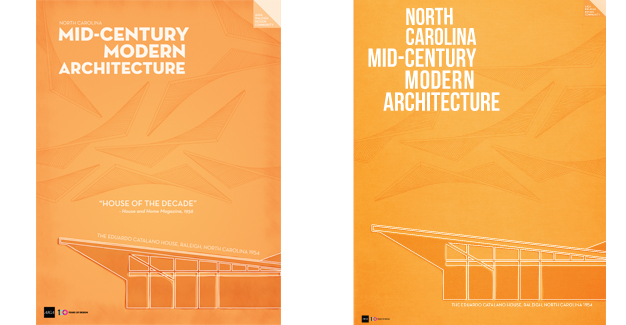
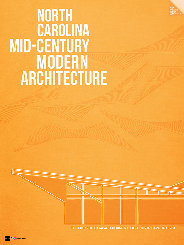
I love Mid-Century Modern design and I knew that I wanted to work in that style, so I selected the 1954 – 1963 decade. I also knew what subject I wanted to depict. About four years ago, when I was a part of the Branding Project for AIGA Raleigh, I did some research into the history of design in the Triangle and I discovered that North Carolina has the third largest concentration of Modernist houses in America. Who knew? I love this style of architecture and so I tucked that bit of trivia away in my mind, which came in handy when I was deciding what the subject of my poster would be.
One of Raleigh’s most famous Modernist homes was the Eduardo Catalano house built in 1954. The house’s defining feature was it’s hyperbolic parabaloid roof. I knew that I wanted to use this feature in my poster design. But before I started designing my poster I did some visual research to find sources of inspiration of the Mid-Century Modern style I wanted to work in.

Image Source: http://www.jetsetmodern.com/catalano.htm
Here are a few of the inspiration pieces I found and drew from to create my poster design.
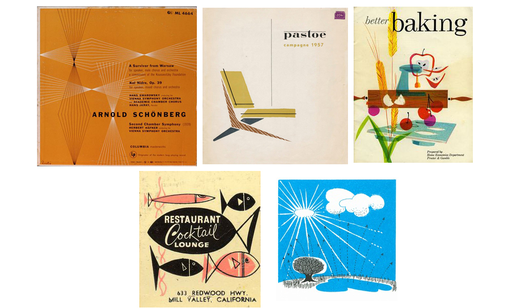
When I saw this piece below by Alvin Lustig, I knew how I wanted to use the hyperbolic parabaloid roof in my design. I loved the line pattern element in this piece, and thought a line drawing of the roof, like the diagram featured in House + Home in August 1955 (shown above), would be a great way to pay homage to the house’s defining feature. You might think I also got my color inspiration from this piece, but no, orange is my favorite color, so that was pretty much the first design decision I made.
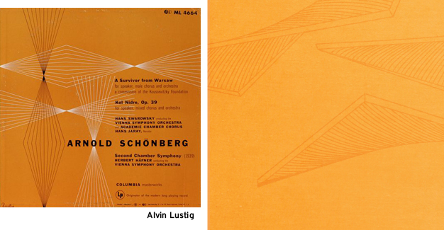
Another thing I like about the Lustig piece was the simplicity of it. Something I also liked about this piece:
Clean simplicity is one of the defining characteristic of Mid-Century Modern design, so I wanted my design to reflect that. I wanted to use very few design elements, and the ones I did use would be simple and graphic in nature.
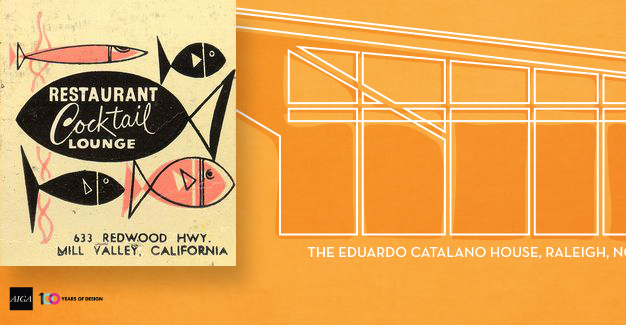
This fun cocktail lounge graphic above inspired the graphic style in which I rendered the image of the Catalano house. I really liked the simple line drawings and the out-of-register color. I found this style illustration a lot in my research. The style is usually done with a black stroke, but I didn’t like the way that looked in my design, and I really wanted to use only two colors—orange and white.
The fill color for the house as well as the roof pattern are set to the multiply blend mode. I used a slight texture in the background of the poster and wanted that to show through in the design. The decision to use texture and the multiply blend mode were influenced by this piece:
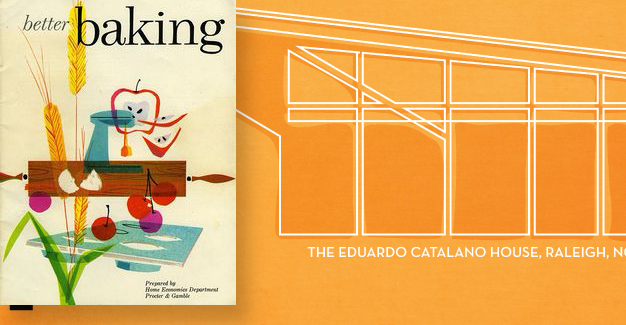
I really liked the subtle texture and how the images overlapped using the multiply blend mode. I also liked the wood grain texture in this piece as well as how it was used in the Pastoe chair piece, but it just didn’t make sense or look right in my poster.
I think the most challenging element of my design was the typography. I started out using my favorite typeface, Neutraface. I love the look of it and it seemed appropriate for the time period and the subject matter. Neutraface was was designed by Modernist architect Richard Neutra and was used in his commercial and residential buildings.
As much as I love the typeface, I wasn’t loving it in my poster design. I think it made the piece more present-day modern than Mid-Century Modern. So I looked to one of my favorite design books, Retro Graphics: A Visual Sourcebook to 100 Years of Graphic Design for inspiration, where I found this typographic style that I thought would be work better.
Once I revised the typographic treatment of the poster’s headline, I was ready to add in some texture. I went to Photoshop for this, as it is a much better tool for adding texture than Illustrator is. There is a lot of subtle textures used in this piece, maybe a little too subtle, I’ll just have to wait to see it printed to determine that for sure. But as subtle as the texture is, I felt it made a huge difference. I think it helped to both add interest and to age the piece a little. One thing I noticed about all of my inspiration sources, was that they had a textured appearance that matched the age of the work. The work was all printed on different surface papers that have aged over time, and I wanted my poster to have a similar feel to it.
I really enjoyed working on this project, and am honored and excited that it was selected as one of the posters that will be printed and displayed at the Centennial Celebration on September 10 and in the Poster Tour that will travel throughout the Triangle.
I hope you enjoyed reading about my process on this project, and I hope you will come see it in person at the Centennial Celebration and on the Poster Tour.
Did you enter a poster in the exhibition? We would love for you to share your process and what inspired you as well. If you would like to share, please contact blog@raleigh.aiga.org.