First off, I want to thank Robb for making the trip from Philly—where he was enjoying lovely 70 degree weather—to Raleigh—where we are sweatin’ to the ’90’s—to share his knowledge of the world’s fanciest pen tool. Robb, an extremely talented illustrator and genuinely nice guy, has spent the last eight years working as an illustrator, designer, and print maker. All of his work is illustration-based and most of it is screen printed. At this month’s Homegrown, he shared some of his workflows, shortcuts and techniques to make your illustrator work go faster and be more precise while still keeping that hand done feel when translated from your pencil sketch concepts.
Robb likes the edibility that refining a sketch in Illustrator affords. You can move things around and it’s all non-destructive to the original sketch. As a tool Illustrator can be used to achieve both organic and mathematically symmetrical styles. When vectoring an illustration, the style you want to achieve can determine how detailed your sketch is. Geometric shapes lend well to a looser sketch, which can be recreated with Illustrator’s shape tools, while an organic style uses the sketch as a guide to trace over, so it should ideally be more a detailed sketch.
Robb builds his art to the size of the final product. He does this because he adds color, color shading, and texture in Photoshop. Through the magic of time lapse video, Robb took us through his process all in one hour. I always enjoy getting a peek inside an artist process, it’s very insightful. You always learn something and pick up some new tricks.
Robb’s process begins with a hand drawn sketch. I liked his reasoning for why you should always sketch your concepts, even if its only a rough guide for placement. He says that by having the ability to sketch by hand you’ll have better flow and the vector process will feel more organic if you do it by hand first. He pointed out that sketching by hand is where your personal style comes from.
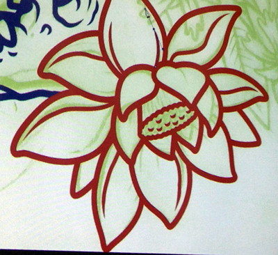
Robb suggests, when you are creating the sketch, if there are elements you plan to repeat, save your self time and do it in Illustrator. To give repeated elements a hand drawn look, alter them by adjusting the path, direction, and/or adjusting the width. He also advises to learn to judge when it’s better or easier to build shapes in illustrator as opposed to tracing them, especially with small detailed areas, like the center of the lotus flower in his sketch.
The star of Robb’s vector process is Illustrator’s Width Tool (  Shift = W). Introduced in CS5, the width tool is ideal for “inking” your sketches, because you can create custom profiles to create the desired look. Robb creates a few width profiles on his art board before beginning to trace his sketch, and saves them as new width profiles. Width profiles are saved with the artwork file, so it’s helpful to have the profiles on the board, it’s also easier to evaluate the profiles on the art board rather then the thumbnails in the drop down menu, when deciding which you want to use.
To create the width profiles. Use the line tool (\) to draw a line, then with the Width tool, click on the center of the line and drag the node (what the width points are called) handles to the desired size. Hold the alt/opt key to create a one-sided profile. Then add nodes at the end points. If you don’t make the center point first, Robb points out, then the line will go flat in the center. Add as many nodes as desired to achieve the look you desire. Before saving the profile (by clicking the disk icon at the bottom left of the panel), zoom in all the way on the end points and ensure that nodes are exactly on the ends. The profiles are starting points, you will likely need to adjust them as you go. Before you start tracing, go to the Appearance Panel and make sure the “New art has basic appearance” option in unchecked. This way all new paths will have the last used width profile applied.
Now pick a profile and start tracing you fine artwork! Keep your paths open like the actual drawing. Robb advises that you should create all your paths in the direction in which they should face. Don’t plan on using the reflect tool if you decide you want to flip the path, because the profile will change direction with the path.
A time saver if you have repeated elements, like the spine details of a leaf, is to use the blend tool. Create two lines and then use the blend tool to create the lines in between. Use the specified steps option. You can adjust the width node of one of the paths in the blend and the rest will update. You will likely want to expand the blend to make adjustments. Use the Expand command under the blend tool to do this, rather then the Object > Expand command. Always save a working layer with strokes intact so you can go back and make changes if needed.
Robb shared the secret to how your favorite illustrators create add amazing shading and textures to their artwork. Shhh…the secret is, do it in Photoshop. Sure, you could try adding shading with blends and the gradient mesh in Illustrator but that’s so time consuming and imprecise., and generates a huge file size.
Robb copies with final vector artwork—which he sets to rich black—into Photoshop. He adds color on separate layers and then groups the shapes by color. Especially useful for preparing artwork for screen printing. He then adds the all the shading on a separate layer. He draws rough a path around the area to shade, converts the path to a selection, adds a feather, then chooses a large soft edge brush and begins to paint in the shading with shades of gray. Always save your path before turning it into a selection in case you need to come back to it. He finds this method to give better more natural results than using the gradient tool.
The paths don’t have to be accurate, as they will be covered by the line art. Sometimes there are areas that are easier and faster to select with the magic wand. So use it, and if needed use the lasso tool to remove areas you don’t want to shade. Robb did this to shade one half of the leaves in his illustration. He does all the shading in one layer, which is set to the Multiply blend mode.
Robb went over how to create different shading styles. One option, of course is to use the layer as is once you’ve finished adding all the shading. To add a dotted texture shading, use the Reticulation filter. But first duplicate the shading layer to a new document with the color mode set to grayscale.
Find the Reticulation filter under Sketch in the Filter Menu. Robb sets the foreground level to 0. If the dots are smaller than desired, you can lower the resolution of the file and apply the filter. This will result in larger dots, as they are generated based on the document resolution. Before copying the shading layer back to the original illustration, bump the resolution back up.
To create a halftone shading effect, choose Color Halftone under Pixelate in the Filter menu. He sets the max dot size to 6 or 8. He doesn’t adjust the screen angle settings.
With both the Reticulation of Color Halftone filters, you may want to use the Threshold adjustment to get rid of any gray areas in the shading before copying the layer back to the main artwork.
Robb creates the shading in grayscale because the final print will be screenprinted. Each additional color applied to the artwork means another layer of ink needs to be the applied. So to lower the number of separations he keeps the shading to grayscale. If you do not plan to screen print, then go ahead and use color in your shading.
When shading his artwork, he rarely uses a reference image. Mostly because he has done a lot of research finding reference images prior to starting the sketch. Part of the process for creating the artwork is research.
Through out Robb’s presentation he showed time lapse videos of his entire process, pausing and slowing it down to demonstrate points he wanted to emphasize. I thought this was very helpful in getting a sense of how he edits the paths and width profiles as he works. It was also cool to see the entire process.
This was another great Homegrown. Thank you so much Robb for sharing your work and your process with us, and of course for returning to Raleigh to present it to this sell out crowd.